Code
library(sf)
library(tidyverse)
library(tmap)
library(gstat)
library(ncf)
library(spdep)Space matters: Spatial pattern lets us understand process. Where point patterns ask whether locations themselves are clustered or random, autocorrelation asks how a measured quantity — lead in soil, snow depth, bird diversity — varies across space and at what scale that variation operates.
Start with the Intro section of Hijmans’s Spatial autocorrelation. Move onto the Moran’s I section as you work through this page. Also, go back to Fortin et al. (2016) from last module paying particular attention to Spatial Autocorrelation Coefficients section. You can start Ch 8 in Bivand (2008) but we will get to that in the next module more deeply.
Bivand R (2008) Interpolation and Geostatistics. In: Applied Spatial Data Analysis with R. Use R!. Springer, New York, NY.
Fortin, M.J., Dale, M.R. and Ver Hoef, J.M. (2016). Spatial Analysis in Ecology. In Wiley StatsRef: Statistics Reference Online (eds N. Balakrishnan, T. Colton, B. Everitt, W. Piegorsch, F. Ruggeri and J.L. Teugels). doi:10.1002/9781118445112.stat07766
The packages we are going to use are below.
library(sf)
library(tidyverse)
library(tmap)
library(gstat)
library(ncf)
library(spdep)Ok. Quite a few new pacakges this time. We’ve got our standards like sf(Pebesma 2026), tidyverse(Wickham 2023) and the mapping package tmap(Tennekes 2025). But we are going to pull in some of the heavy hitters in terms os spatial analysis gstat(Pebesma and Graeler 2026), ncf(Bjornstad 2026), and spdep(Bivand 2026) as we get deeper into spatial tools.
We covered point patterns already and that was fun and interesting in the kind of way studying logic is interesting. Quantifying spatial pattern by just looking at points alone is all well and good if you are counting trees – and counting every tree. Recall that Ripley’s K requires you to have a completely enumerated point pattern. Few environmental data sets I encounter are point patterns. Alas. But the huge amount of data in spatstat is making me feel lazy. I’ll admit, revisiting spatstat got me thinking how cool point patterns are.
But what if your variable of interest isn’t as well behaved as a forest stem plot or a map of star positions? And what if you want to know the magnitude of correlation in a continuous variable as it varies in space? For instance, you might want to measure metal deposition in snow on Mt. Baker. You could lay out a nice grid and sample that. You might run a transect up the mountain. Or you might give bags to skiers heading into the back/side/slack country and tell them to take a sample when the spirit moved them (citizen dirtbag science). These types of sampling schemes are more common in most environmental fields and are not point patterns. But all would have good information and likely have interesting spatial structure.
With this module, we are going to start quantifying spatial structure for a variety of data types.
In the first half of the 20th century, the pioneering ecologist Alex Watt gave us the “pattern-process paradigm” that we use today. Typically, in environmental science, and especially in ecology, we make a huge effort to understand ecological processes by understanding the patterns they produce.
Environmental data are typically characterized by a pattern: observations from nearby locations are more likely to have similar magnitude than by chance alone. This is spatial autocorrelation and the first challenge we have with environmental data is to quantify the magnitude, intensity, and extent of spatial structure in the data.
The two tools we are going to cover in this module are variograms and Moran’s I. But first…
Distance matrices and nearest neighbors are the bread and butter of spatial analysis – much as it is in ordination and multivariate analysis. In ESCI 503 you think about distance and dissimilarity matrices a lot. If you haven’t thought about distance in awhile, recall that we can calculate geographic distances on a plane using the Pythagorean theorem. There are more sophisticated ways (e.g., cost paths), but this is the simplest form of distance to calculate and almost always what we use in spatial analyses if our data are projected (not in latitude and longitude). So, if we have two points with locations specified by x and y we find the the Euclidean distance between them as: \[D=\sqrt{(x_2-x_1)^2 + (y_2-y_1)^2}\]
It’s important that you are comfortable with the idea of calculating pairwise distances for a set of points. E.g., let’s look at an example of five points:
We can look at the distance matrix D via
D <- dist(dat)
D
1 2 3 4
2 0.8038407
3 0.6990545 0.6918722
4 0.9196129 0.2245675 0.9135998
5 0.1353633 0.6747636 0.6657176 0.7844914where the elements \(d_ij\) give the distance between points \(i\) and \(j\). There are \(n*(n-1)/2\) pairwise elements of D – so 10 pairs of values here. Thus, the distance between the first and second points is D[1,2]:
d12 <- round(as.matrix(D)[1,2],2)
d12
[1] 0.8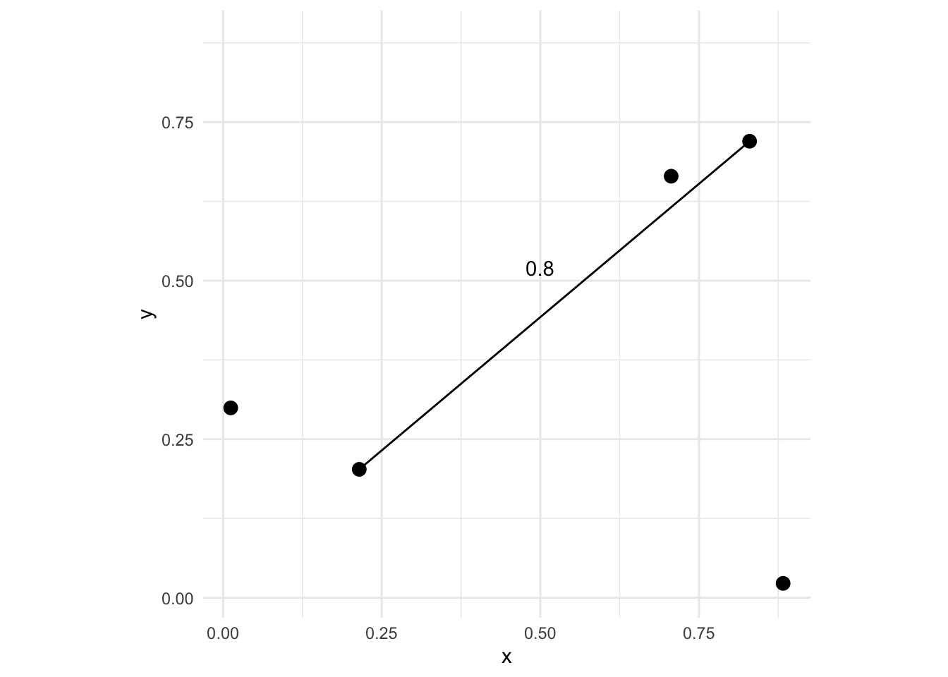
Now imagine that at each one of those points we also measured some variable. If the point locations were trees we might measure their height or diameters. One thing we might want to know is whether or not some measured variable \(z\) has a spatial pattern. E.g., how closely correlated are points that are close together vs points that are further apart. In general, environmental data tends to be positively autocorrelated meaning points near each other tend to be more alike that points that are further away. Characterizing those scales is what we will move onto now.
Let’s use the Meuse River data to illustrate the idea behind autocorrelation. This is a classic spatial data set that has coordinate data (a plain data.frame) with measurements on metal concentrations in soils as well as some other soil variables. We will return to these data again and again. It’s a classic data set. Look at the help file for more details as well as the projection info. Here is a link to a Google Map of the site which is in the Netherlands on the border with Belgium. Someday I’ll visit this site after so many years of working with these data.
data(meuse.all)
class(meuse.all)
[1] "data.frame"head(meuse.all) sample x y cadmium copper lead zinc elev dist.m om ffreq soil
1 1 181072 333611 11.7 85 299 1022 7.909 50 13.6 1 1
2 2 181025 333558 8.6 81 277 1141 6.983 30 14.0 1 1
3 3 181165 333537 6.5 68 199 640 7.800 150 13.0 1 1
4 4 181298 333484 2.6 81 116 257 7.655 270 8.0 1 2
5 5 181307 333330 2.8 48 117 269 7.480 380 8.7 1 2
6 6 181390 333260 3.0 61 137 281 7.791 470 7.8 1 2
lime landuse in.pit in.meuse155 in.BMcD
1 1 Ah FALSE TRUE FALSE
2 1 Ah FALSE TRUE FALSE
3 1 Ah FALSE TRUE FALSE
4 0 Ga FALSE TRUE FALSE
5 0 Ah FALSE TRUE FALSE
6 0 Ga FALSE TRUE FALSEWe can transform the data.frame to a sf object by specifying the coordinates and the projection information.
meuse_sf <- st_as_sf(meuse.all, coords = c("x", "y")) %>%
  st_set_crs(value = 28992)
And make a plot of the lead concentration in the soils.
ggplot(data = meuse_sf) +
  geom_sf(mapping = aes(fill=lead,size=lead),shape=21,alpha=0.6) +
  scale_fill_continuous(type = "viridis",name="ppm")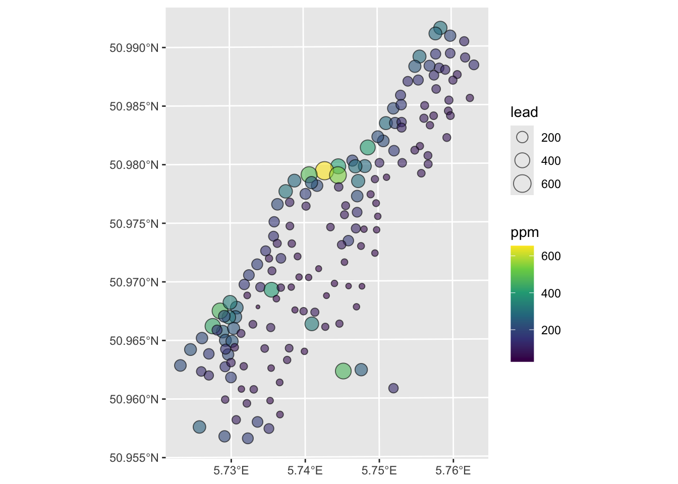
I made the plot below with the tmap library. I’m just sticking this here to give you a view of the site. It’s not hard but it’s also not required. Some folks always want to go the extra mile – so this is a chance for that if you want to.
Anyways, here is the site:
tmap_mode('view')
tm_shape(meuse_sf) +
tm_dots(col = "lead", palette = "viridis")Let’s consider the simplest measure of spatial autocorrelation by calculating something called a semivariogram. We will use the gstat library to do so but could calculate this a few different ways – there are several variogram functions in R.
In this approach, we quantify spatial autocorrelation by examining the data set one pair of points at a time. The easiest way of getting a first blush of how autocorrelated spatial data are is by calculating and plotting a semivariogram. We do this by measuring the distance between two locations (recall Euclid!) and plotting the squared difference between the values of some variable (\(z\)) at that distance. We call this mass of points a semivariogram cloud. So we have \(n(n-1)/2\) elements in a distance matrix and for two points \(i\) and \(j\) we calculate the distance via \(d_{ij}=\sqrt{(x_j-x_i)^2 + (y_i-y_j)^2}\) where \(x\) and \(y\) are the coordinates of the points and we plot that distance against the squared difference of the variable (\(z\)) as \(\gamma_{ij} = (z_i - z_j)^2\).
Thus, if pairs of points that are close together in space also have a smaller squared difference they are spatially autocorrelated. Typically, as points become farther away from each other the squared difference increases. At some distance, the squared difference levels out and the data tend to be uncorrelated.
Now we will make and plot the variogram. Think of the variogram as a measure of environmental distance with respect to Euclidean (geographic) distance.
leadVarCloud <- variogram(lead~1, locations = meuse_sf, cloud = TRUE)
plot(leadVarCloud,pch=20,cex=1.5,col="black",alpha=0.1,
     ylab=expression(Semivariance~(gamma)),
     xlab="Distance (m)",main = "Lead concentrations (ppm)")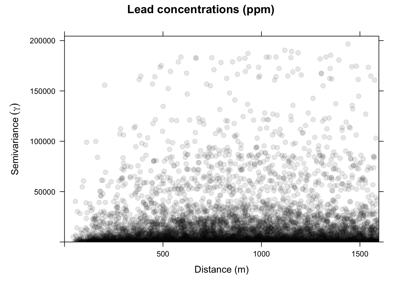
On the x-axis of the plot is the distance between the locations, and on the y-axis is the difference of their lead values squared. That is, each dot in the variogram represents a pair of locations, not the individual locations on the map. This is a bit messy. Typically, we don’t look at the cloud of points but rather get an average model value at a few distances and the variogram function is conservative in looking at distances within a safe range.
leadVar <- variogram(lead~1, locations = meuse_sf, cloud = FALSE)
plot(leadVar,pch=20,cex=1.5,col="black",
     ylab=expression(Semivariance~(gamma)),
     xlab="Distance (m)", main = "Lead concentrations (ppm)")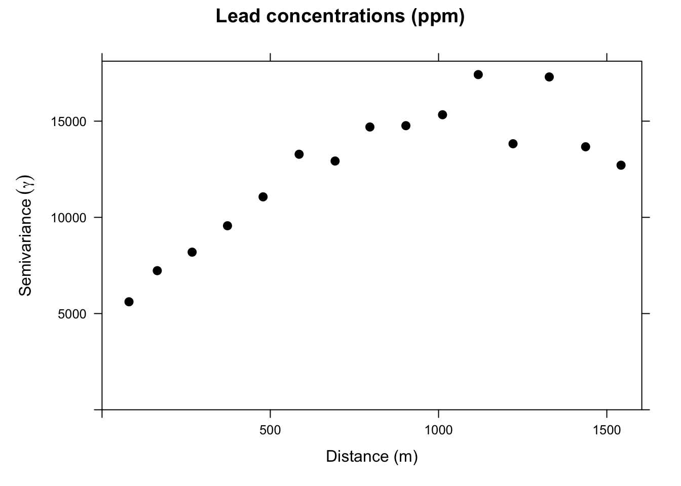
This is a lot cleaner. Note the change in the y-axis range. We got rid of an awful lot of noise by averaging the \(\gamma\) values. Just by eyeballing this we would likely think that lead concentrations in this data set are autocorrelated out to a distance of about 750m because \(\gamma\) is small at distances less than a 750m We will learn how to fit curves (models) to variograms later in class. The models let us estimate the value of \(\gamma\) for any distance.
~1 construct?You might be wondering about the lead~1 in the call to variogram above. Reasonable. Recall that the ~ notation is integral to R’s approach to statistical modeling, allowing you to specify what’s on the left-hand side of the model and what’s on the right. E.g., lm(y~x) specifies a linear model where y is as a linear function of x. The ~1 notation indicates that we want an intercept-only model. This convention goes back to the S language, which predates R. The roots of this notation likely stem from the early development of statistical programming languages, aiming to make modeling more intuitive and accessible - more algebraic as opposed to matrix-based, perhaps.
The ~1 concept specifically refers to a formula that includes only the intercept term, without any predictor variables. It means that the model should include only the intercept (a constant term) and no other predictors. This is often referred to as an “intercept-only” model or a “null model.” So lm(y~1) creates a linear model where y is predicted solely by the mean value of y, which corresponds to the intercept. It assumes that the best prediction for the response variable is simply its average (for continuous outcomes) or the overall probability (for binary outcomes). The use ~1 is not especially widely used but I do see it for comparisons of models where it is used as null model as a baseline to compare with more complex models that include predictors.
Consider our example with lead above and look at the output for this linear model.
summary(lm(lead~1,data=meuse_sf))
Call:
lm(formula = lead ~ 1, data = meuse_sf)

Residuals:
    Min      1Q  Median      3Q     Max
-121.55  -79.80  -32.55   53.20  505.45

Coefficients:
            Estimate Std. Error t value Pr(>|t|)
(Intercept)  148.555      8.603   17.27   <2e-16 ***
---
Signif. codes:  0 '***' 0.001 '**' 0.01 '*' 0.05 '.' 0.1 ' ' 1

Residual standard error: 110.2 on 163 degrees of freedom
You can see it has only an intercept term (no slope). The Estimate for the intercept is mean of meuse_sf$lead and the Std. Error is its standard error.
mean(meuse_sf$lead)[1] 148.5549sd(meuse_sf$lead)/sqrt(nrow(meuse_sf))[1] 8.603444So, when we use variogram above as variogram(lead~1, locations = meuse_sf) we are asking for the autocorrelation of lead with no other predictor variables. Later in the class, we will look at ways of assessing spatial structure in the presence of predictors but for now we will leave it as an intercept-only model.
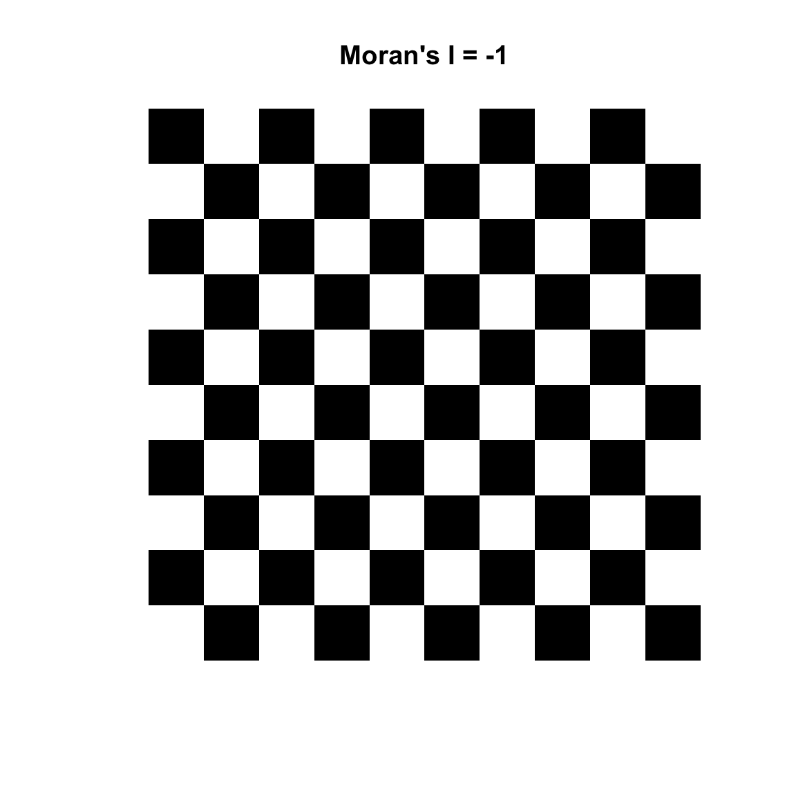
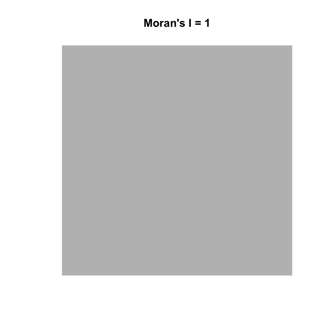
Variograms are nifty tools – but it would be nice to work with a technique that gave us more familiar numbers. Fortunately, there are other methods of measuring spatial autocorrelation beyond the variogram. The text introduces the idea of measuring spatial autocorrelation and explains how it is trickier than temporal autocorrelation because it is multi-dimensional and multi-directional. The reading starts you out with measuring spatial autocorrelation using Geary’s C. The statistic used more commonly is Moran’s I which is close to the inverse of Geary’s C (but is not identical). Values of Moran’s I greater than zero indicate positive spatial autocorrelation and values below zero indicate negative autocorrelation. Values range from minus one (perfect dispersion – think chess board) to positive one (perfect correlation). A zero value indicates spatial randomness.
Moran’s I is defined as:
\[I= \frac{N}{\sum_i \sum_j w_{ij}}~\frac{\sum_i \sum_j w_{ij}(Z_i-\bar{Z})(Z_j-\bar{Z})}{\sum_i(Z_i-\bar{Z})^2}\]
where \(N\) is the number of observations at \(i\) and \(j\), \(Z\) is the variable being measured, and \(w\) is a matrix of weights (e.g., the inverse of the distance between points).
Reading this through I can hear those that are paying attention saying, “Wait, what about this weights thing?” Good! We can use weights to give some elements more or less influence on a statistic than other elements in the same set. So for instance, elements that we want to have less influence can be multiplied by a scalar from zero to one. Unweighted elements can be multiplied by one and elements that we might want to give extra weight to can be multiplied by a number greater than one. We do this in in practice with the weights matrix \(W\). We will see how this works below.
Moran’s I has the lovely property that its values can be transformed to Z-scores for hypothesis testing. Thus, Moran’s Z-scores greater than 1.96 or smaller than −1.96 would indicate significant spatial autocorrelation at alpha of 0.05. This is handy.
First though we have to figure out how to make R give us what we want. There are two packages that I use to do Moran’s I. The first is spdep which is insanely powerful but has super-weird syntax and data structures until you get used to them. But it’s really flexible in how you calculate and use the weights matrix. The second is ncf which is a little more intuitive but not as flexible. We’ll use both.
spdepLet’s use the spdep library and calculate Moran’s I for a different variable from the the Meuse River data. The syntax for doing Moran’s I with spdep is a little hard to get used to because of the object structure the library uses but I like it because the way \(W\) is specified is explicit – nothing happens behind the scenes.
Let’s demonstrate Moran’s I using logged lead values from the Meuse River data. And we will use a weight matrix (\(W\)) that is made of the inverse of the Euclidean distance between points. Inverse distance is only one way of creating spatial weights. Other common ways include looking only at a certain number of neighbors (K nearest neighbors) or looking only at neighbors within a fixed distance band. More on that below.
OK, here is Moran’s I for the logged values of lead using an inverse distance weights matrix:
# distance matrix
d <- dist(st_coordinates(meuse_sf))
# inverse distance matrix
w <- as.matrix(1/d)
# convert a the weights matrix to a weights list object
# so spdep is happy
wList <- mat2listw(w)
# calculate I
moran.test(meuse_sf$lead,wList)
    Moran I test under randomisation

data:  meuse_sf$lead
weights: wList

Moran I statistic standard deviate = 10.687, p-value < 2.2e-16
alternative hypothesis: greater
sample estimates:
Moran I statistic       Expectation          Variance
     0.1009726698     -0.0061349693      0.0001004419
The results from this indicate that the lead data are positively (but weakly) autocorrelated when we use \(W\) as inverse distances. This means that measurements of lead that are close in space will be associated with each other. Note that this is looking across all the points because we are calculating a weights matrix that uses all the points. In reality, the value of Moran’s I above 1000 m don’t have a lot of influence because \(W < 0.001\) when distances are greater than 1000m but all the elements of \(W\) have some influence. You could draw this if you thought about it, but here is the relationship between distance and inverse distance:
x <- as.vector(as.matrix(dist(st_coordinates(meuse_sf))))
y <- as.vector(w)
ggplot() + geom_line(aes(x=x[x>0],y=y[x>0])) +
  labs(x="Distance (m)",y="Inverse distance (aka W)") +
  lims(x=c(0,1500))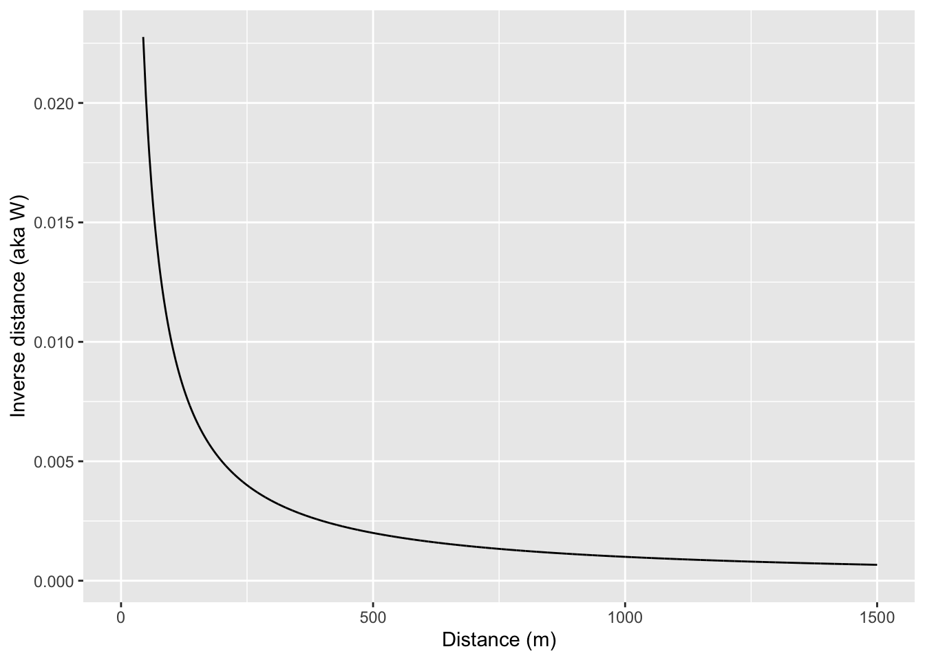
If we want to we could calculate a weights matrix explicitly by looking at distance. E.g., here we will make \(w_{ij}=1\) when \(d_{ij}<100\) and \(w_{ij}=0\) when \(d_{ij}\geq100\)
d <- as.matrix(dist(st_coordinates(meuse_sf)))
# make an empty weights matrix
w <- matrix(0,ncol=ncol(d),nrow=nrow(d))
# set some values to 1 using a logical mask of d<100
w[d<100] <- 1
# convert a the weights matrix to a weights list object
# so spdep is happy
wList <- mat2listw(w)
# calculate I
moran.test(meuse_sf$lead,wList)
    Moran I test under randomisation

data:  meuse_sf$lead
weights: wList

Moran I statistic standard deviate = 9.4272, p-value < 2.2e-16
alternative hypothesis: greater
sample estimates:
Moran I statistic       Expectation          Variance
      0.784497747      -0.006134969       0.007033667
Note that Moran’s I is quite large when using only points within 100m of each other. Let’s look at only points between 500 and 1000 m of each other.
# make an empty weights matrix of the right dimensions
w <- matrix(0,ncol=ncol(d),nrow=nrow(d))
# set some values to 1
w[d>500 & d<=1000] <- 1
# convert a the weights matrix to a weights list object
# so spdep is happy
wList <- mat2listw(w)
# calculate I
moran.test(meuse_sf$lead,wList)
    Moran I test under randomisation

data:  meuse_sf$lead
weights: wList

Moran I statistic standard deviate = -6.6794, p-value = 1
alternative hypothesis: greater
sample estimates:
Moran I statistic       Expectation          Variance
    -0.1077445658     -0.0061349693      0.0002314141
Now we can see that points far away from each other (between 500m and 100m) are not correlated. So, by using \(W\) cleverly, we can determine the distances where autocorrelation occurs and where it does not.
I like to look at Moran’s I in a correlogram by distance – kind of like we did with the variogram and in a way that is conceptually very similar to the Ripley’s K function. We can do this as above by calculating Moran’s I in different distance bands. That is, if we stratify the weights \(W\) by distance we can plot Moran’s I as a function of distance. I’m going to do this by brute force in a loop – it’s ugly. What happens below is that I create a vector of distances from 0 to 2000 m in increments of 200 m. The the loop will step through that vector and create a weights matrix so that \(W\) will equal one if points are within the specified distance and zero otherwise. Then I’ll calculate Moran’s I and save the result.
So here is a Moran’s I a correlogram by distance 0 to 1500 m in 200 m bins:
distanceInterval <- 200
distanceVector <- seq(0,2000,by=distanceInterval)
n <- length(distanceVector)
d <- as.matrix(dist(st_coordinates(meuse_sf)))
# make an object to hold results
res <- data.frame(midBin=rep(NA,n-1),I=rep(NA,n-1))
for(i in 2:n){
  w <- matrix(0,ncol=ncol(d),nrow=nrow(d))
  # set some values to 1
  w[d >= distanceVector[i-1] & d < distanceVector[i]] <- 1
  # convert a the weights matrix to a weights list object
  # so spdep is happy
  wList <- mat2listw(w)
  # calculate I
  res$I[i-1] <- moran.test(meuse_sf$lead,wList,zero.policy=TRUE)$estimate[1]
  # centered distance bin
  res$midBin[i-1] <- distanceVector[i] - distanceInterval/2
}
ggplot(data=res, mapping = aes(x=midBin,y=I)) +
  geom_hline(yintercept = 0, linetype="dashed") +
  geom_line() + geom_point(size=3) +
  labs(x="Distance (m)",y="Moran's I")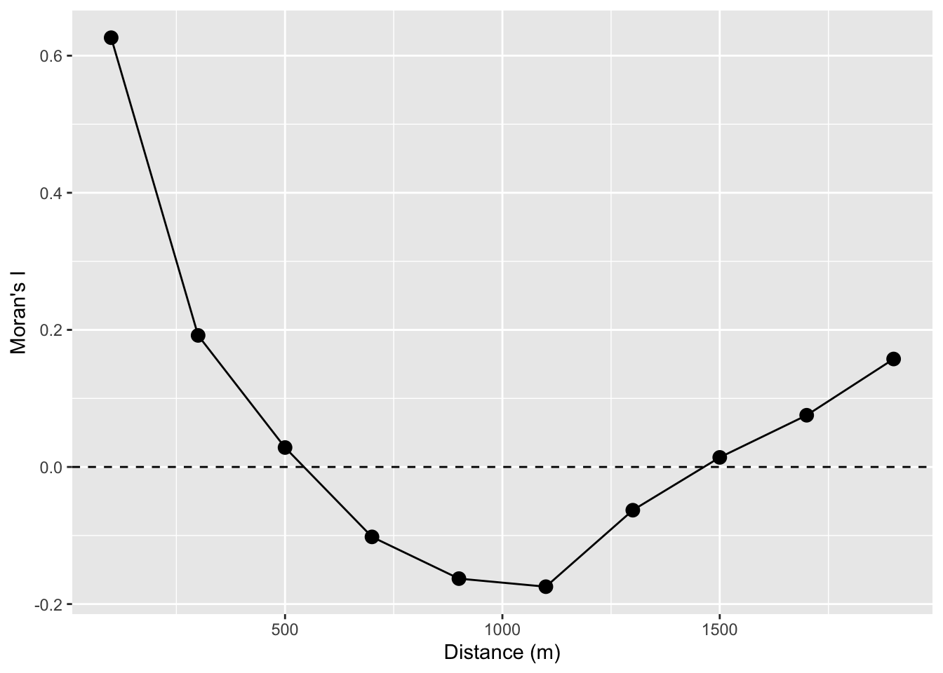
Take a look at the loop. The indexing is pretty convoluted! But will let you see, hopefully, how we can make the \(W\) matrix do our bidding by setting distances we specify to either zero or one and thus let us calculate Moran’s I as a function of distance.
Looking at the figure, we see that the values of lead are autocorrelated for a few 100m and then fall off. Again, this is conceptually similar to both the Ripley’s K figure and the variograms above. If we wanted to we could have saved the p-values and colored them by significance. But that would be even more cumbersome that it is already. Don’t fret too much – there are automated ways of going about this that we will see in the next section.
We are working with point data here. And I typically work with either point data or raster data. But a lot of spatial analysis deals with polygons and it’s pretty common in those cases to think about spatial structure in terms of neighboring polygons as opposed to thinking about distance. I’m not going to go into this much. Bivand spends a lot of time on it in the reading but I’ll give a quick example.
Often, and especially with areal data, we calculate the weights matrix using just the correlation between the \(k\) closest neighbors and usually set \(k=8\) (there is nothing magical about eight – it is a loose kind of rule).
w <- knn2nb(knearneigh(meuse_sf,k=8))
moran.test(meuse_sf$lead,nb2listw(w))
    Moran I test under randomisation

data:  meuse_sf$lead
weights: nb2listw(w)

Moran I statistic standard deviate = 11.512, p-value < 2.2e-16
alternative hypothesis: greater
sample estimates:
Moran I statistic       Expectation          Variance
      0.406297811      -0.006134969       0.001283454
I realize the code here is kind of opaque. There are three functions above that take some getting used to. E.g., knearneigh tells you the \(k\) nearest neighbors for each point, knn2nb takes the \(k\) nearest neighbors and turns it into a neighbor object nb, and then nb2listw takes an nb object and makes it useful to the moran.test function. Simple and not at all convoluted, right? (The very smart people that made this had good reasons for doing what they did!)
But what do we see here? If use the eight nearest neighbors to calculate spatial autocorrelation the value of Moran’s I jumps way up. Near is like near when it comes to lead. Kind of cool. If we looked at 16 neighbors we’d see Moran’s I of 0.28 which is still pretty high. It we looked at 32 neighbors? Moran’s I of 0.123. So, more neighbors, greater distances we get declining values. See where I’m going with this?
n <- 7
res <- data.frame(k=2^(1:n),I=rep(NA,n))
for(i in 1:n){
  w <- knn2nb(knearneigh(meuse_sf,k=2^i))
  res$I[i] <- moran.test(meuse_sf$lead,nb2listw(w))$estimate[1]
}
ggplot(data=res, mapping = aes(x=k,y=I)) +
  geom_hline(yintercept = 0, linetype="dashed") +
  geom_line() + geom_point(size=3) +
  labs(x="K neighbors",y="Moran's I")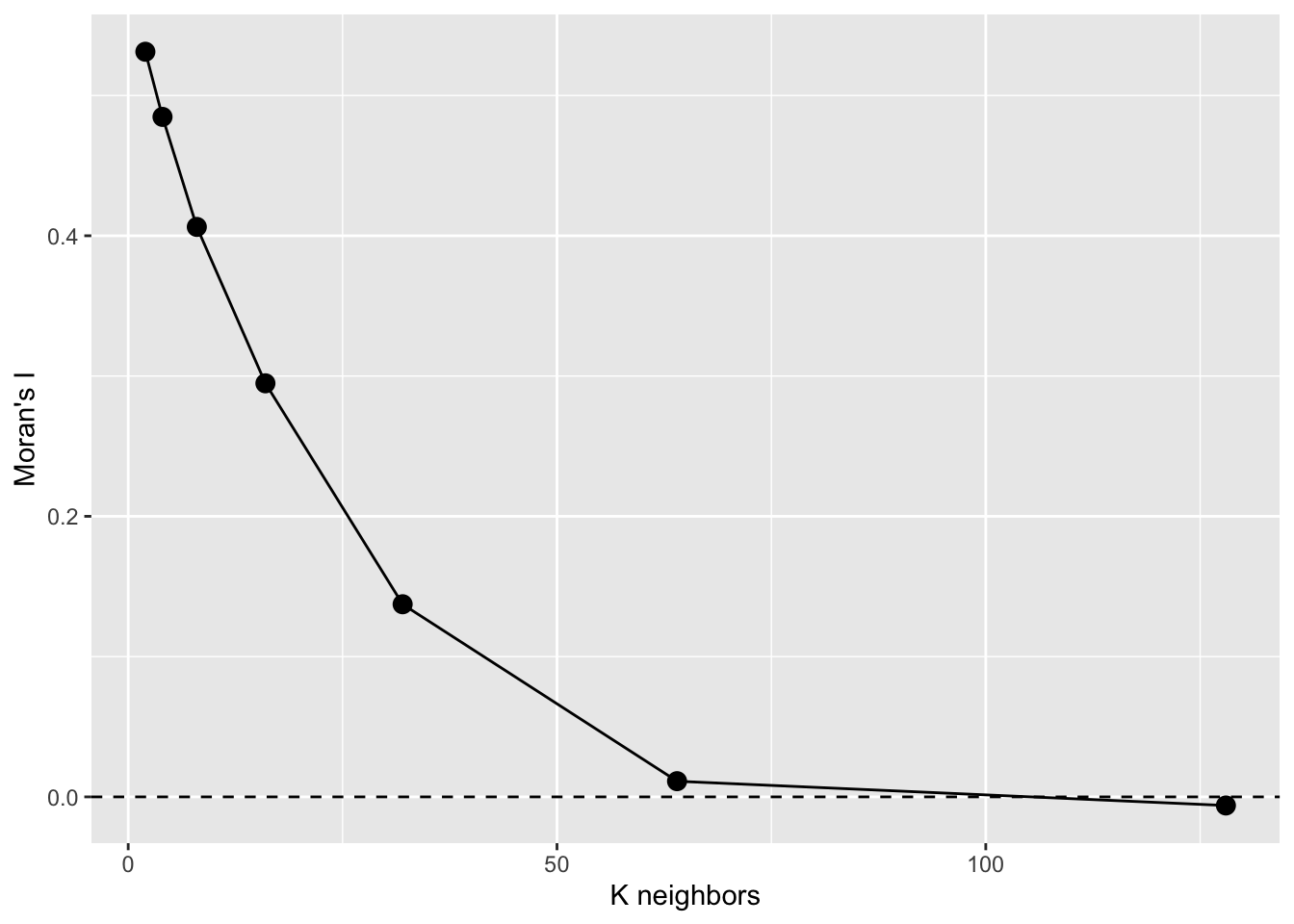
That’s a Moran’s I a correlogram by the number of neighbors. Because these are points, I prefer to look at Moran’s I in a correlogram by distance – like we did above but if we had to deal with polygonal data, we’d likely use this approach. See text for more info.
ncfThe spdep(Bivand 2026) library is fantastic but doesn’t produce the correlogram in the way we often see it with Moran’s I by distance (\(I=f(d)\)). The ncf(Bjornstad 2026) library does this out of the box.
There are two functions we will look at to do this. One uses distance categories and one makes a continuous function.
Let’s grab the x, y, and z data from meuse_sf for convenience.
meuseX <- st_coordinates(meuse_sf)[,1]
meuseY <- st_coordinates(meuse_sf)[,2]
meuseLead <- meuse_sf$leadFirst the discrete plot of Moran’s I by distance categories:
leadI <- correlog(x=meuseX, y=meuseY, z=meuseLead,
                  increment=100, resamp=100, quiet=TRUE)
plot(leadI,xlim=c(0,1500))
abline(h=0,lty="dashed")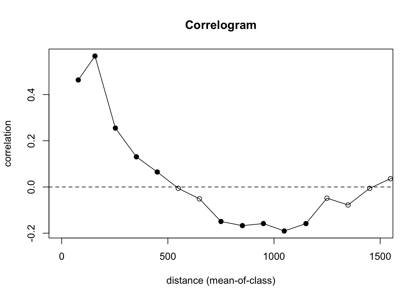
Let’s look at what is going on here. We are calculating \(I=f(d)\) and using 100 m increments. We are also doing significance testing with 100 permutations of the data to test a null hypothesis of CSR. In the plot, the points are colored be whether or not autocorrelation is significantly different from zero in that distance class using a nominal (two-sided) 5%-level. This is a slightly fancier version of what we did in the loop above. And the syntax is much easier to follow.
We still see the same result we did above – positive autocorrelation out to distances of about 500 m, very slight negative autocorrelation around 1000 m, and CSR otherwise.
Oh, one more thing. Remember how the point pattern functions in spatstat were very careful about not letting you run into edge effects? And variogram is that way too. The correlog function is not so careful! It’s more libertarian its approach.
Here is the whole data set. in the default plot.
plot(leadI)
abline(h=0,lty="dashed")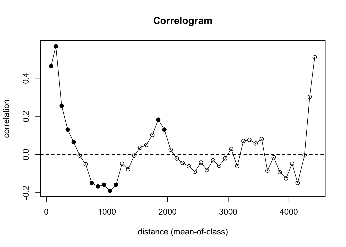
That’s nutty. There are so few pairs of points to compare at longer distances that you get a bunch on nonsense (hence the non-significant values with high values of I). We need to truncate the analysis. Let’s look at how we can get a safe distance that should mitigate edge effects.
Let’s look at the extent of the distances in the data. The coordinates span about 2800 m by 3900 m:
max(meuseX) - min(meuseX)[1] 2785max(meuseY) - min(meuseY)[1] 3897The furthest point-to-point distance is about 4400 m.
meuseD <- dist(cbind(meuseX,meuseY))
max(meuseD)
[1] 4440.764So we want to look at distances out to about 4400/3 or about 1500 m. Beyond that we will run into a low number of pairwise comparisons and get into edge issues.
Yet, the correlog function is happy to let you calculate Moran’s I out to those irresponsible distances (e.g., look at tail(leadI$mean.of.class)). That’s why I truncated my plot with xlim. Again in general, you want to look at distances less than 1/3 of the max span of your points.
Oh, one more thing for the ggplot crowd. Note that all the data for the correlogram is stored in an easy to access fashion in the leadI object. You can roll your own plot in you want in ggplot. And unlike the default plot above, we can control the alpha level for plotting the significance from the permutation test. E.g.,
data.frame(n=leadI$n,
           I = leadI$correlation,
           d = leadI$mean.of.class,
           p = leadI$p) %>%
  mutate(Significant = p < .01) %>%
  ggplot() +
  geom_hline(yintercept = 0,linetype="dashed") +
  geom_path(aes(x = d, y = I,group = 1, color=Significant),size=1) +
  geom_point(aes(x = d, y = I, fill=Significant),size=5,pch=21) +
  lims(x=c(0,1500),y=c(-0.6,0.6)) +
  scale_fill_manual(values = c("grey","darkgreen")) +
  scale_color_manual(values = c("grey","darkgreen")) +
  labs(x="Distance (m)",y="Moran's I",
       title = "Autocorrelation of Lead",subtitle = "Crit value of p<0.01")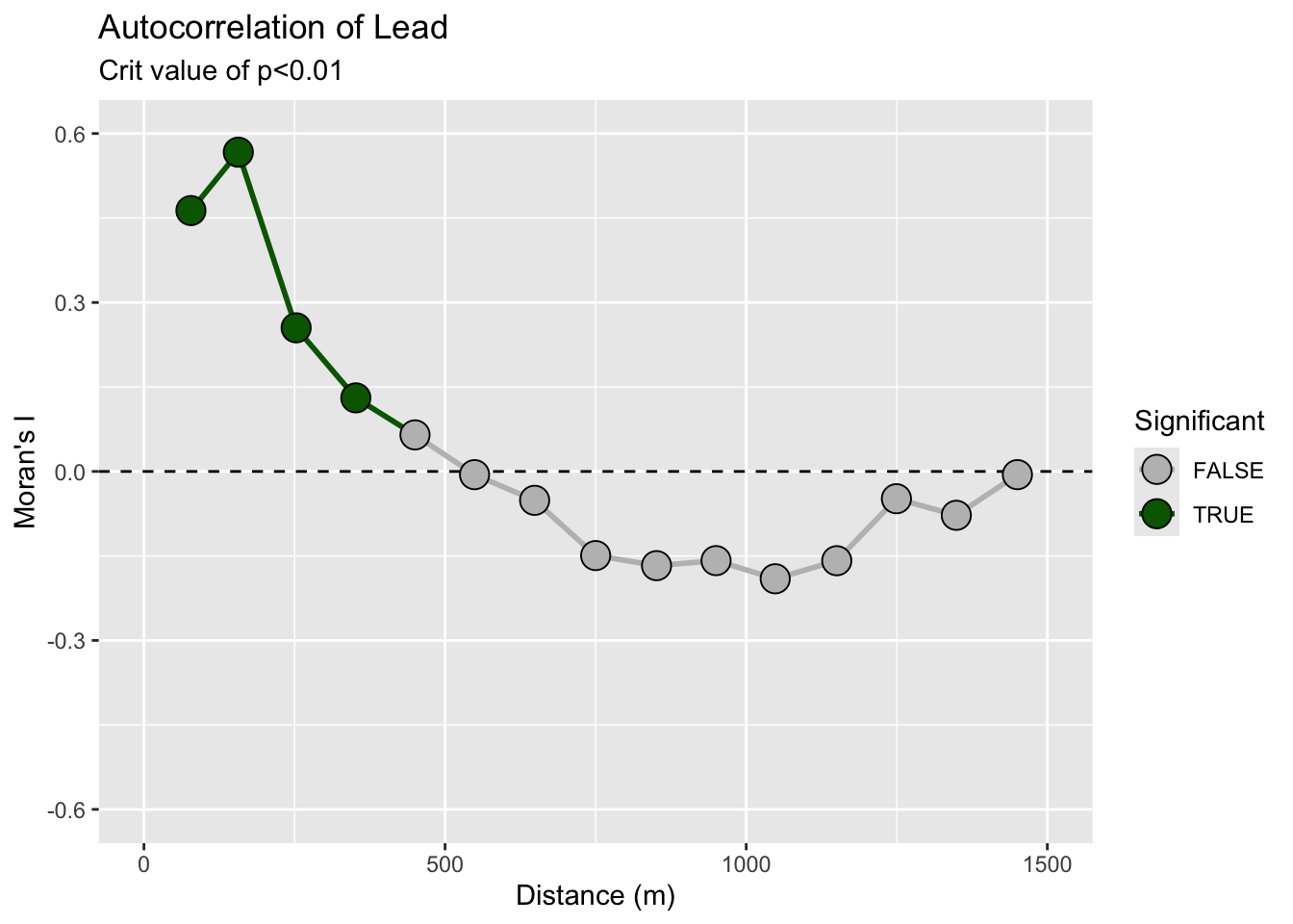
Remember! R will (usually) do what you want if you try.
The plot above is discrete. It is showing autocorrelation in distance categories. We can also calculate a continuous function:
# continuous
leadI <- spline.correlog(x=meuseX, y=meuseY, z=meuse_sf$lead,
                         resamp=100, xmax=1500, quiet=TRUE)
plot(leadI)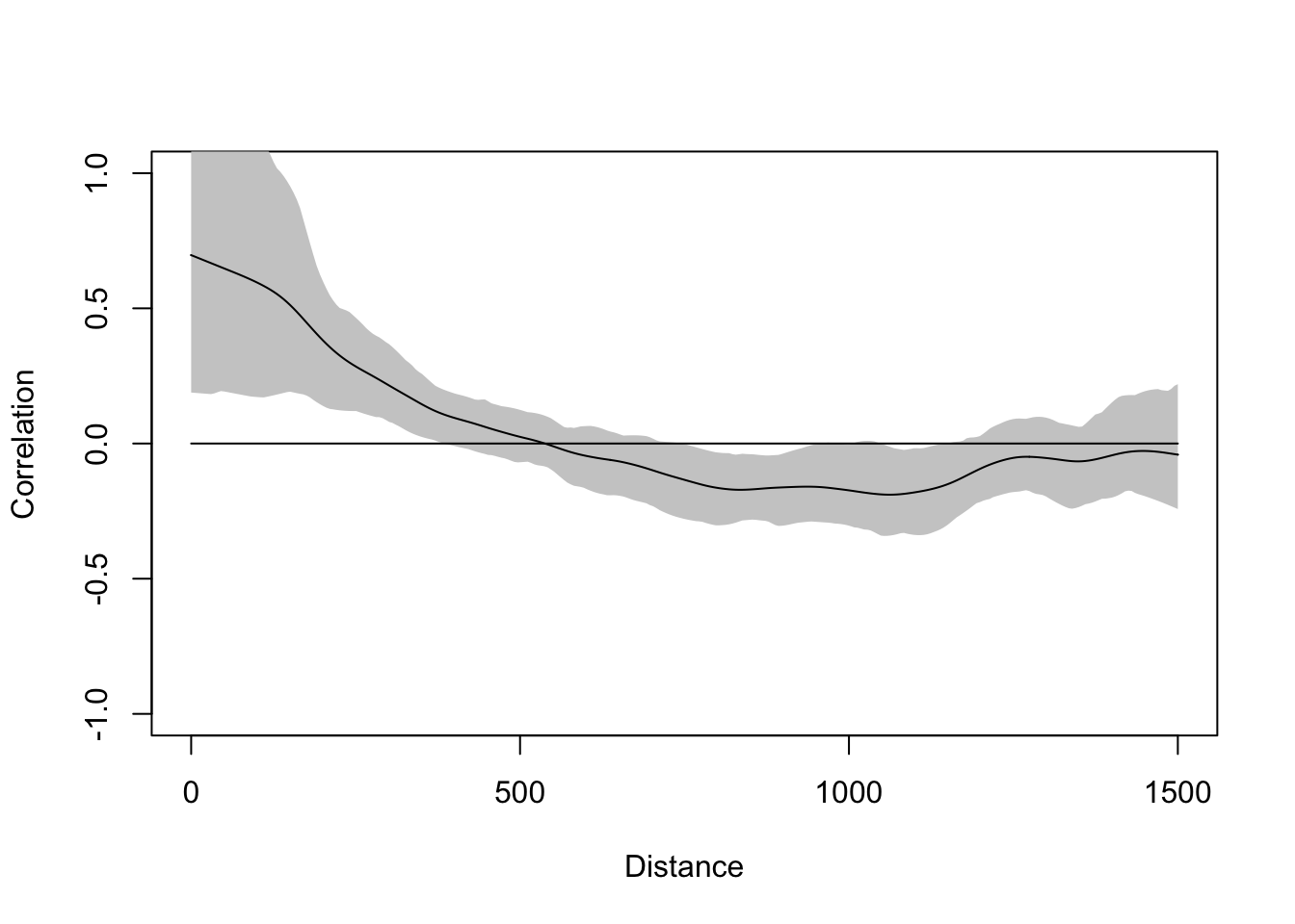
This gives the same picture. You can read up on these functions to learn the subtleties. I’ll unpack this in greater detail in the lecture.
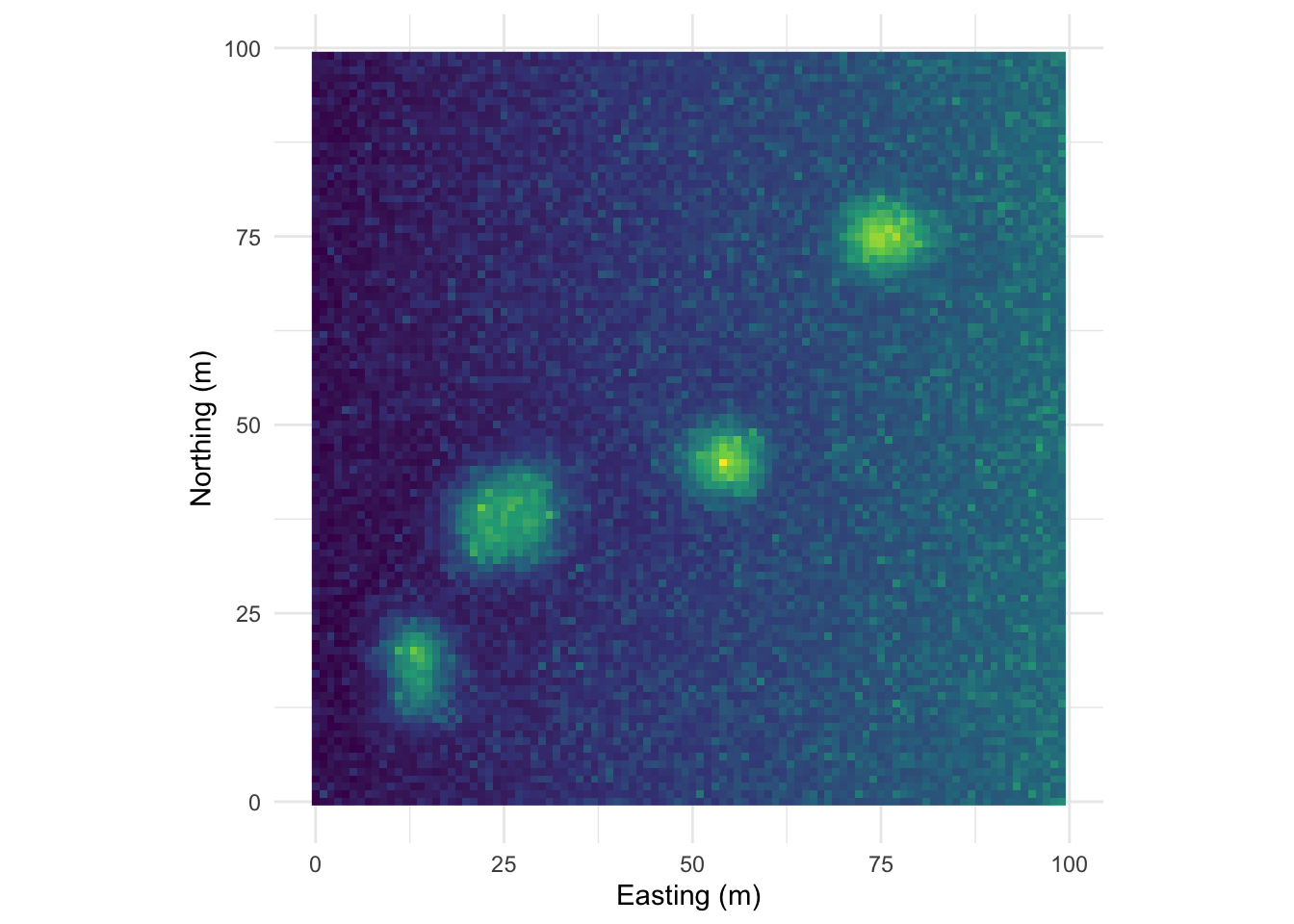
What we did above was with field data, right? By now, you all know that I love making examples with simulated data. Below I’m going to show you four different simulated surfaces. Each is a 100 x 100 grid (10,000 cells) and each has a different pattern on it. The units don’t really matter but I’ve labeled them as meters. The height of the surface can be whatever you like to imagine. Elevation, nitrogen, tree density, etc. Those units range from zero to a max of about one but there is a little added noise (random normal noise with a mean of zero and a standard deviation of 0.1) to make things just a tiny bit fuzzy. We will look at the data and then at the correlogram. It’s illustrative, at least I think so. The code is pretty gnarly to generate these surfaces so I’ve hidden it. Happy to send it along if you’d like. Just holler.
This pattern is made from sine waves so that there are 25 bumps on the surface arranged 5x5. The brighter the color the “taller” the bump.
Here it is as a plotly object that you can rotate and zoom.
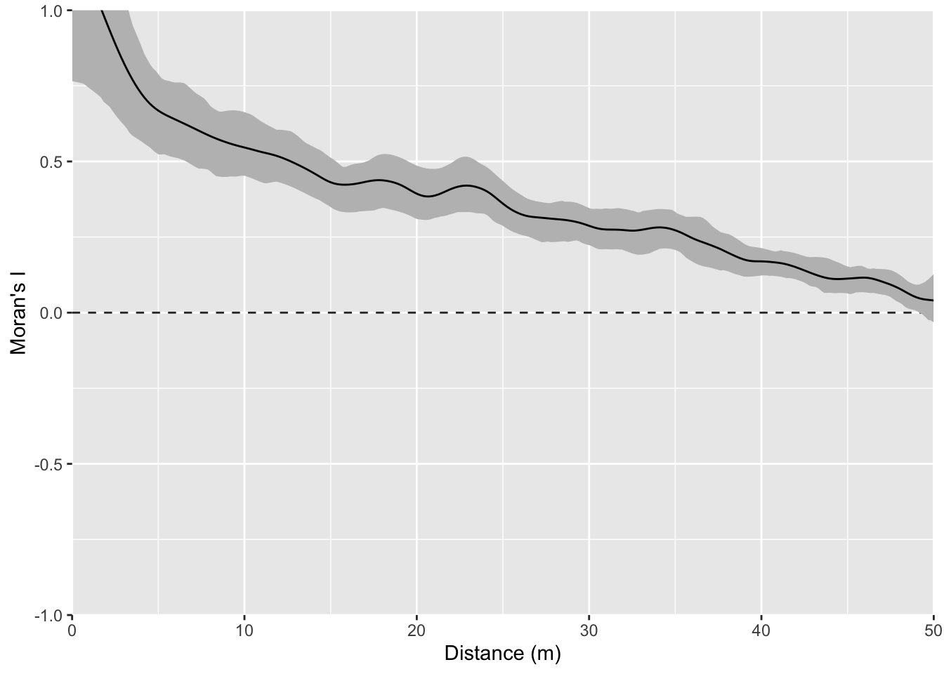
And here is the correlogram. Note extremely high values of Moran’s I (~1) at short distances (inside the bump radius) and the repeating pattern that tells you the distance between the bumps. Also note the magnitude of Moran’s I and that I’m truncating Moran’s I conservatively at 50 m.
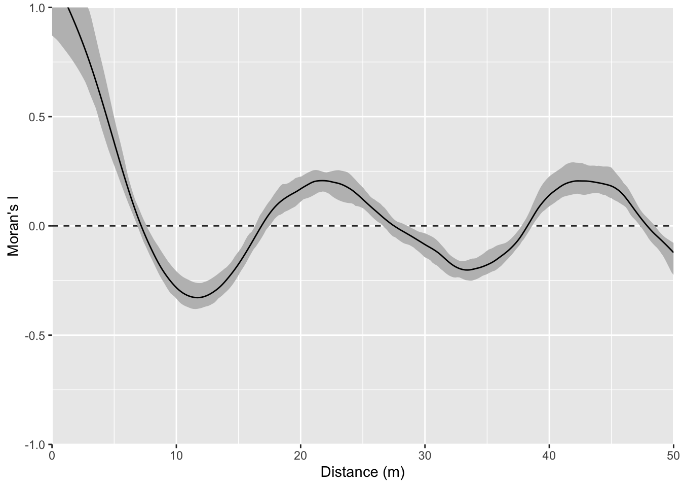
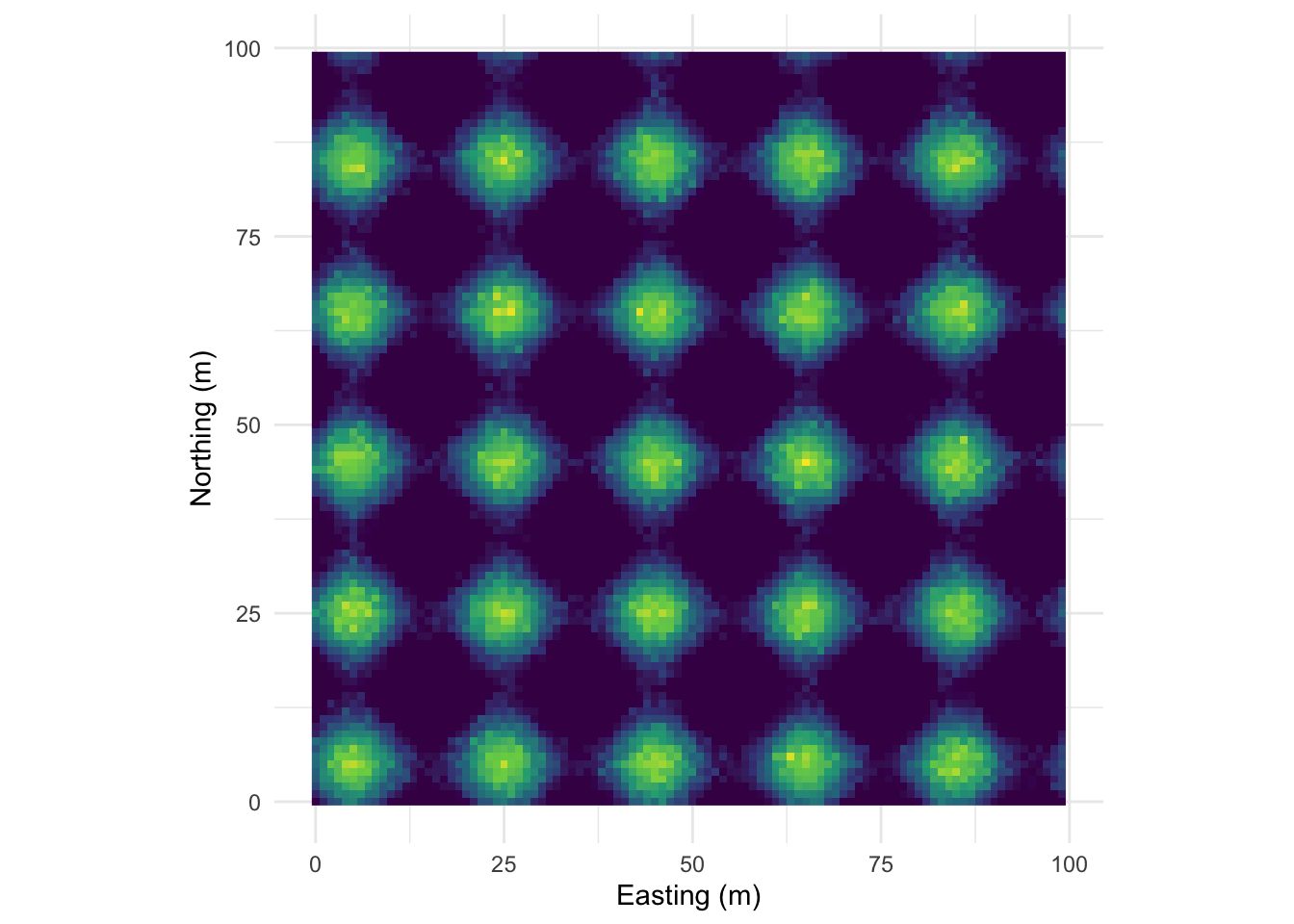
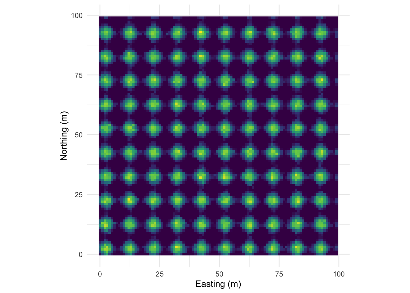
Let’s intensify this uniform pattern to 100 (10x10) bumps.
Map:
Perspective plot:
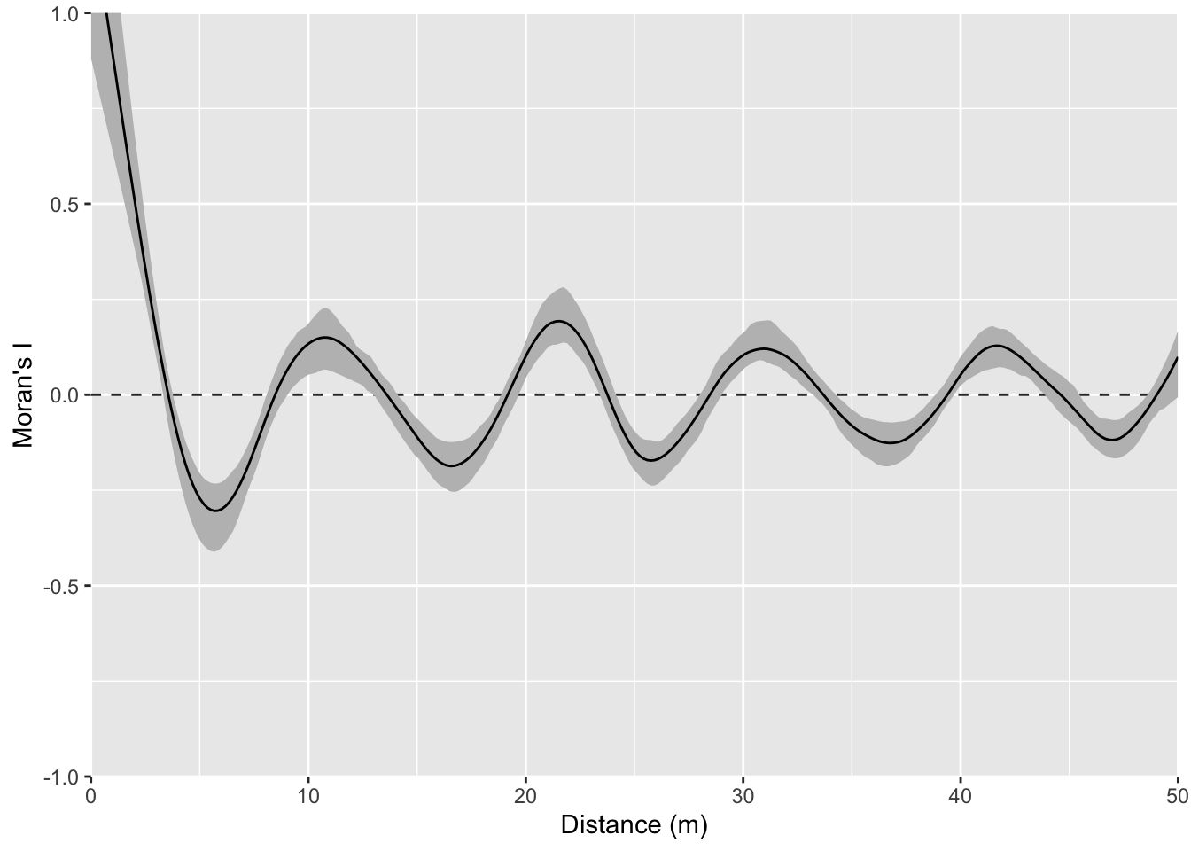
And the correlogram. Compare it to the example above and note how you can see the repeating pattern in the distances between peaks.
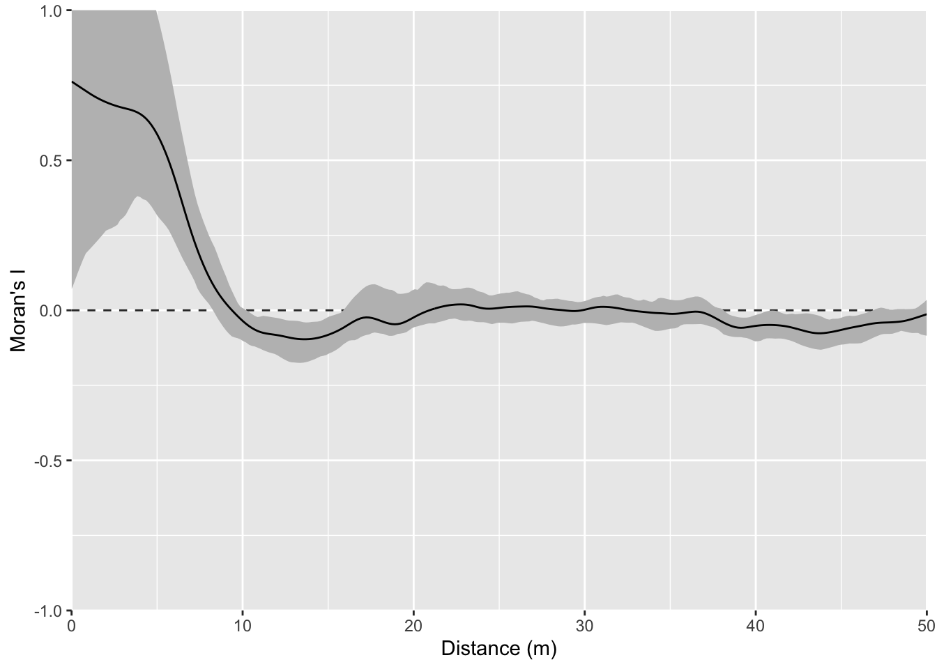
That example above is ridiculously contrived of course. Here is something closer to what real data looks like but with a very clear pattern of homogeneity. Note the intensity of the pattern in Moran’s I. The width of the shoulder can give an idea of the variability in the repeated units.
Map:
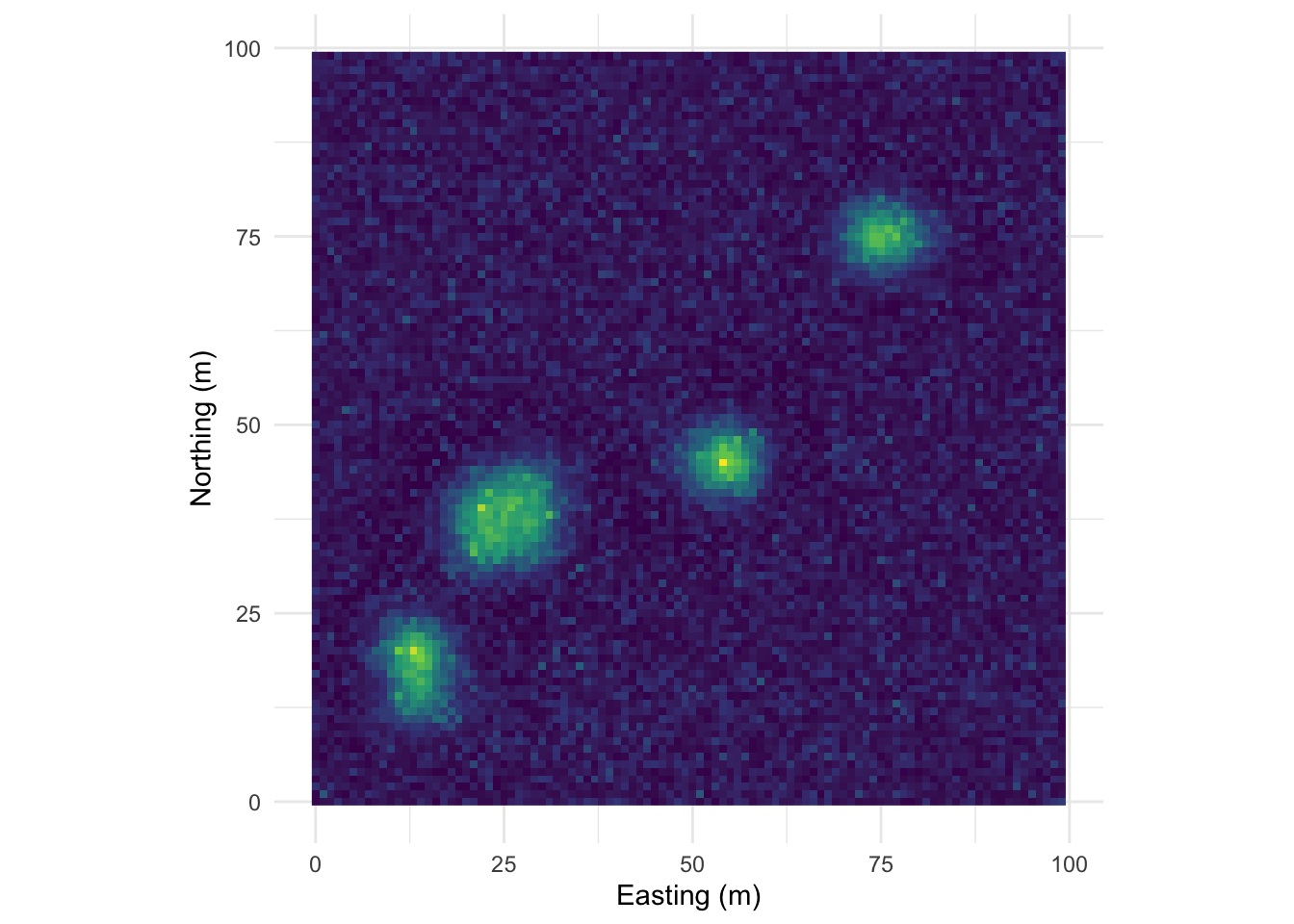
Perspective plot:
Correlogram:
One this surface I’ve taken the random bump map above and added a gradient on the x direction. This is probably the most boring and most important example. Many, many environmental data sets occur on gradients. The gradient (elevation, moisture, latitudinal) can be overwhelming. As we see here the gradient makes the bumps disappear in the correlogram. This isn’t “bad” but it is something to be aware of as we contemplate signals and noise.
Map:
Perspective plot:
Correlogram:
You could imagine detrending this final surface with a model and then replotting Moran’s I. That is, if you modeled z~x, you could take the residuals from that model and remove the gradient. If you did that you’d wind up with the random bumps scenario or something very close to it.
I have a sf object in the file named birdRichnessMexico.rds. That file contains points of bird richness (number of species) at a bunch of points in Mexico. The column nSpecies is the number of bird species occurring within a kilometer of that location.
The data are projected onto a plane (not a sphere) using the North America Albers Equal Area Conic, centered on Mexico (SR-ORG:38) which is an equal area projection suitable for the area. Using this projection allows us to have units in kilometers Here is a simple map of the data using tmap. It’s nice to visualize your data even if what you do is as simple as ggplot(data=birds_sf) + geom_sf(). The more I learn about using tmap the more I like it. Setting tmap_mode("view") gives you an interactive map which is kind of fun. There is a lot more you can do with this if you like this kind of stuff.
library(tmap)
birds_sf <- readRDS("data/birdRichnessMexico.rds")
tmap_mode("view")
tm_shape(birds_sf) +
  tm_symbols(col="nSpecies", alpha = 0.7)
Ok. With the mapping done, take a minute to look at the patterns you see. Some areas are hotspots of richness like in southern Veracruz. Others are less rich – like northern Baja. Richness is quite a bit higher all over though when compared to the biological desert that is western Washington!
Look at spatial autocorrelation in the bird data using Moran’s I (use correlog or spline.correlog) and look at a variogram.
Some tips.
birds_sf out of sf and into a regular data.frame with something like this, which might be easier to use for the correlog functions. That’s up to you.birdsDF <- data.frame(st_coordinates(birds_sf),nSpecies=birds_sf$nSpecies)correlog, watch out for edge effects. You’ll want to limit your analysis to about 1/3 of the maximum distance. So, 1/3 of the maximum distance between points is:max(dist(st_coordinates(birds_sf)))/3[1] 1037.547Given that, I’d limit interpretation of the correlograms to a thousand km.
What can you learn by comparing the approaches? Maybe more importantly what are we missing with this approach? Where does this understanding of pattern help us with process and where is it lacking?
We have been quantifying this spatial structure as being direction independent (isotropic). Read up on the concept of anisotropy in spatial autocorrelation. Where do you see that here? In many spatial data the direction of anisotropy relates to process. For example, pollution plumes move down head or down wind.
Got the idea that direction can be important in determining spatial structure? Play with the variogram function and explore anisotropy by calculating directional variograms for the bird data (read help file for details) and try something like:
birdVar <- variogram(nSpecies~1, data = birds_sf, alpha=c(0,90))Put on a biogeography hat and explain what might be happening here.